
TRUSTutor Application
The tutoring process is often messy and disconnected. Parents struggle to find tutors and track progress, while tutors juggle multiple tools to manage sessions, payment and progress.
Challenge: Design an app that enables tutors to list their services and parents to search for and book sessions with tutors.
Empathise
Understanding users and their frustrations.
I began by interviewing 2 key user groups: parents and tutors which aimed to understand frustrations they face using tutoring services.
Target Participants:
Tutors over the age of 18 who offer a range of services.
Parents over the age of 18 with at least one child who uses a tutor, or are looking for a tutor.
Example Questions:
For tutors: What is your current method of advertising your services?
For parents: How do you keep track of when tutoring sessions are taking place?
Tutors described feeling overwhelmed by managing schedules and advertising services and wished for a more professional system.
Parents found it difficult to stay informed about progress, keep track of appointments and keeping communication clear especially when managing more than one child.
From the interviews I created 2 empathy maps helping me visualise what each user group said, did, thought and felt.
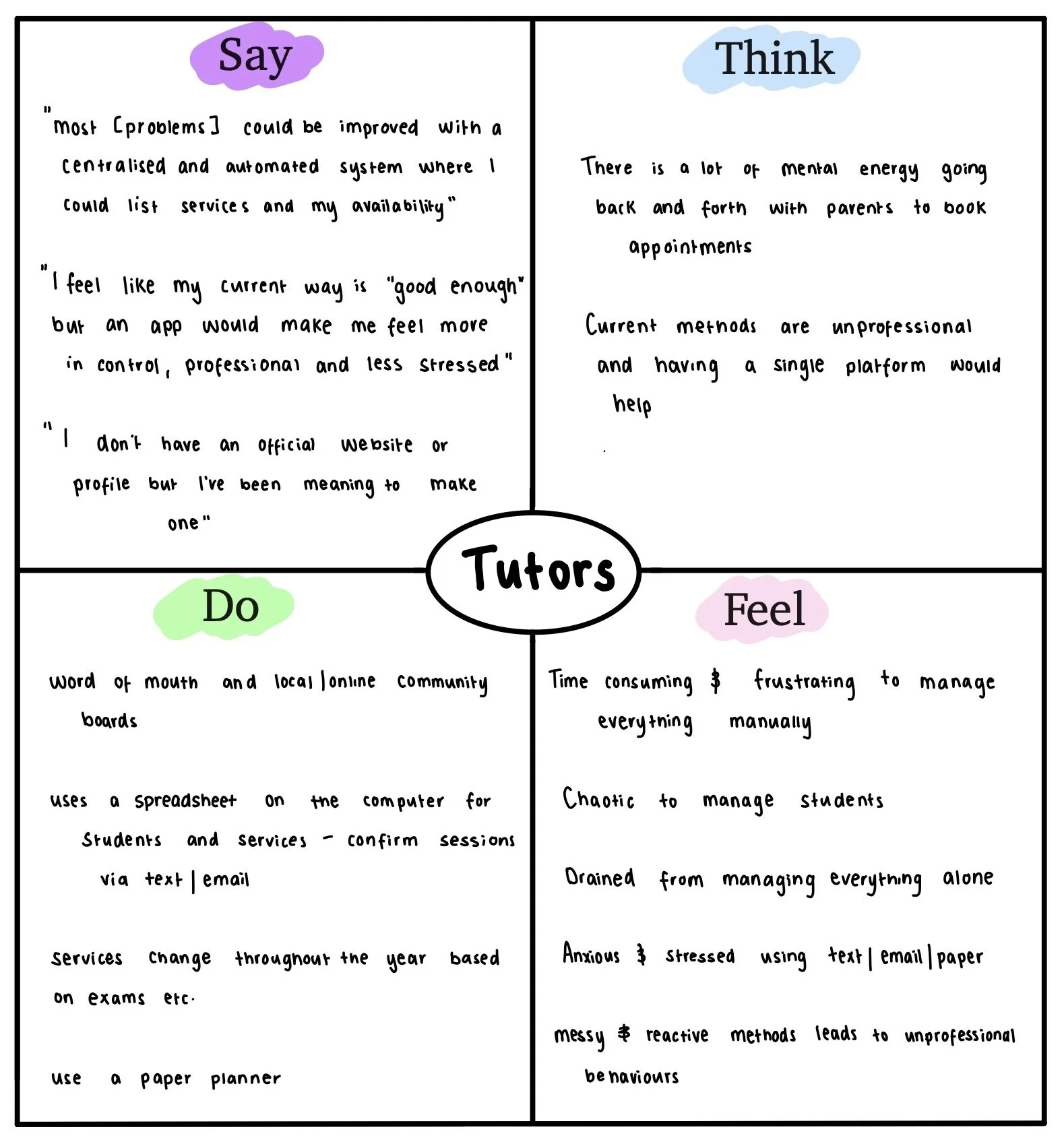
Empathy map showing insights of tutors.
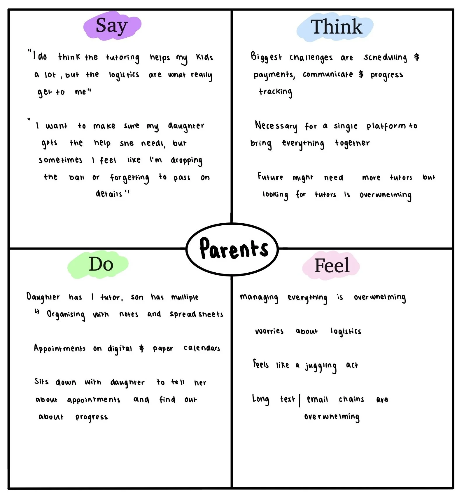
Empathy map showing insights of parents.
Using the insights from the empathy maps, I created 2 detailed personas to keep in mind while completing the rest of the design process:
Claire, a tutor who needs a reliable way to manage lessons, track progress and communicate with parents while professionally advertising her solutions.
Steven, a parent who wants to easily find and book tutors, track his children’s progress and stay in the loop with tutors.
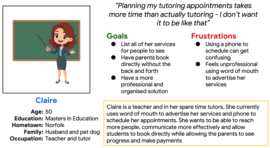
Persona Claire who represents the tutor user group
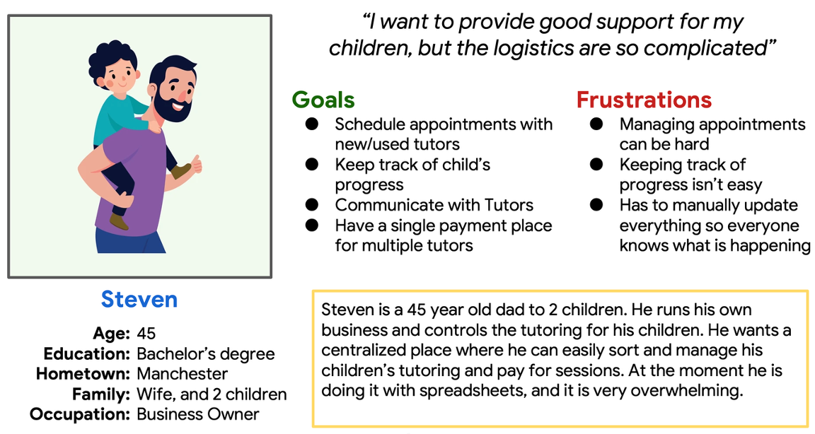
Persona Steven who represents the parent user group
The insights from empathy maps and personas revealed that tutors needed better scheduling tools while parents wanted reassurance through progress tracking
From there I created a list of user stories to help me understand what pain points my users experience and what they want to be able to do. This eventually helped create my feature list for the solution.
An example of a user story focused on Claire:
As a tutor, I want to be able to list my services so parents can see what I offer and I can advertise professionally.
An example of a user story focused on Steven:
As a parent, I want to be able to talk to tutors so I can ensure my child is getting the correct help.
Define
Clarifying the problem and setting direction
Parents and tutors do not have a streamlined and efficient way to manage and book tutoring. They need a solution which combines booking, communication and progress tracking.
Using research insights, I defined clear problem and hypothesis statements to outline the problem I need to solve.
Example problem and hypothesis statement:
Claire is a tutor who needs an app which allows her to give feedback and areas for improvement for her students because she wants parents to be able to see how their child is progressing and support them outside of her tutoring.
If Claire uses the app to provide feedback on her students then parent’s will able to track their progress to feel more involved and confident in the tutoring process.
Problem and hypothesis statements led to the value proposition:
One platform where parents and tutors can connect, communicate and collaborate - making tutoring simple, transparent and trusted.
Ideate
Exploring possibilities and opportunities
To ensure my solution stood out, I conducted a comparative audit of direct and indirect competitors - MyTutor, Tutorful, Khan Academy and Calendly
A balanced experience for both parents and tutors doesn’t currently exist. Competitors prioritise one user group over the other, creating opportunities for me to design a platform that supports both equally.
Interfaces are often text heavy, overwhelming and inaccessible giving me the opportunity to design a more inclusive, intuitive interface.
Trust is very important. Competitors are building trust from the beginning using a range of methods. It is important I ensure parents feel the platform can be trusted.
Key opportunities I can learn from are to: design equal UX quality for both parents and tutors; integrate inclusive, intuitive interfaces for the whole app; take inspiration from Calendly to create a simple and modern interface.
I used two brainstorming methods to generate ideas for how to solve the outlined problem.
Using “How might we” questions, I explored ideas such as
How might we help tutors and parents to schedule and track students tutoring?
How might we make booking and payments frictionless?
How might we get reviews for tutors so parents can make informed decisions?
How might we allow tutors to update parents on progress the student is making?
I used crazy eights to rapidly generate visual ideas and ensure creating an application was the correct path to take. I wanted to ensure there were no other less obvious solutions which could be used.
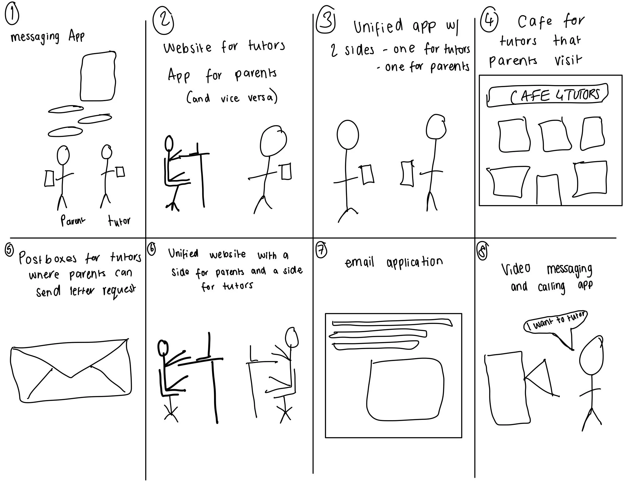
Prototype
I mapped user flows for both sides of the application - parents and tutors. This allowed me to clarify what pages, actions and decisions users would take. It also provided a time for me to think about the different screens the user would experience and what needed designing.
Bringing the concept to life
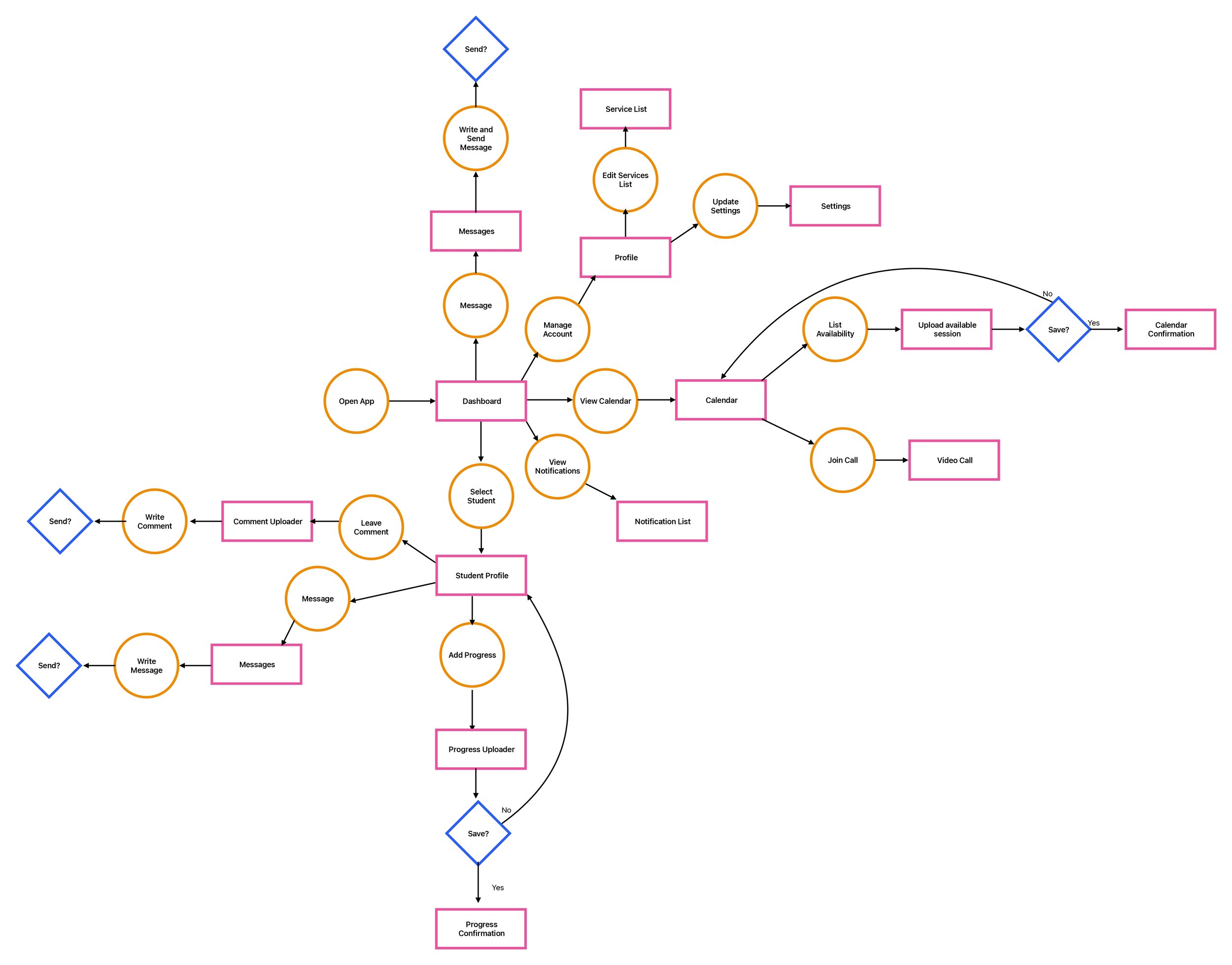
Here is the user flow for the tutor.
It shows how the user can
Message parents
Manage their account - including list services
View their calendar to list availability and join calls
View notifications
Manage students and their progress.
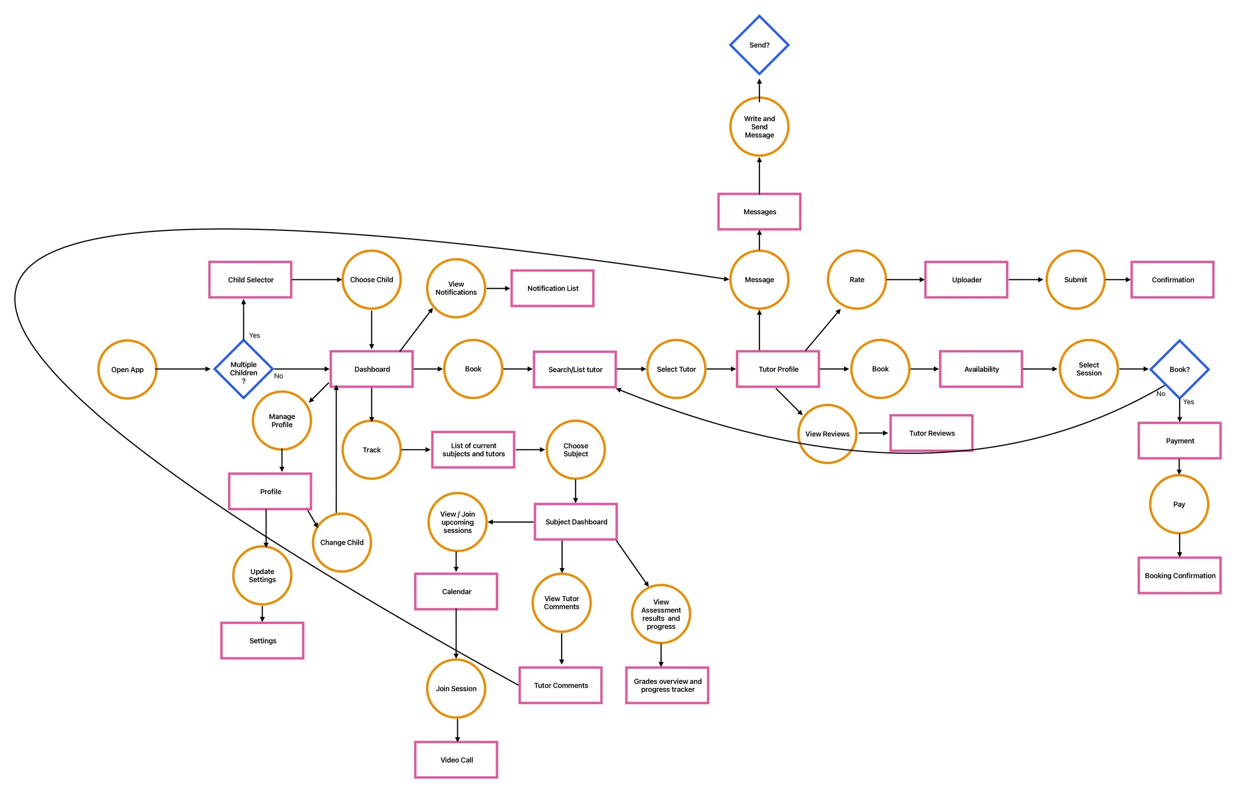
Here is the user flow for the parent
It shows how the user can
Choose between their children
View notifications
Track progress in different subjects
Message and review tutors
See reviews of tutors
Book sessions with tutors.
Manage their profile
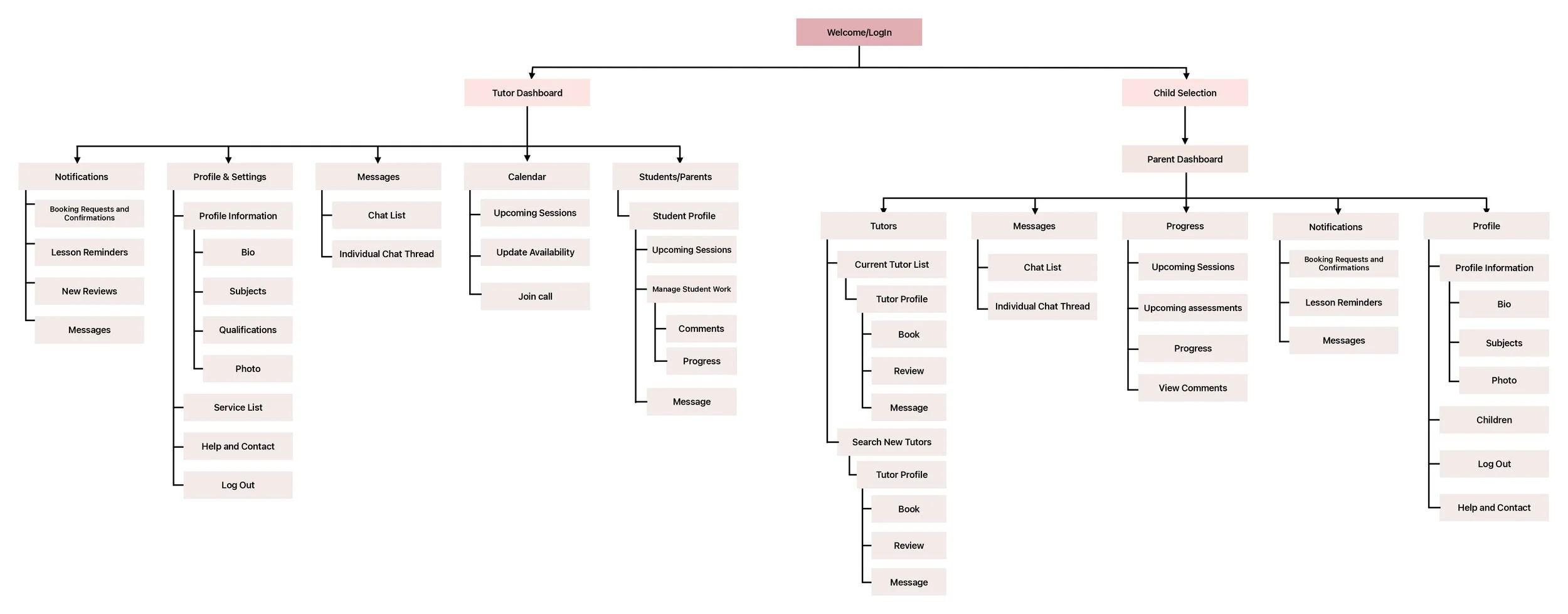
Next, I designed the information architecture to structure the app logically. Each user group has their own dashboard which acts as the homepage where all features can be accessed from.
Then, I moved into wireframing. I sketched ideas on my iPad before refining them into one wireframe in Figma. I experimented with multiple versions of each screen, combining the best aspects into clean, user-friendly wireframes.
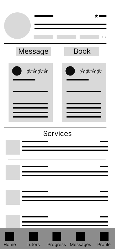
The example below shows the experimentation and the Figma wireframe for the tutor profile. This is from the parent side of the app and is what the user will see when looking at a tutor.
Information map showing the architecture and structure of the system to ensure logical navigation
Lo-Fi Designs

This shows some of the experimentation I did for the tutor profile page which is found on the parent side of the application. Highlighted areas show what I liked about different designs.
This shows the Figma wireframe which brought together the highlighted areas from the sketches.
Upon review, I decided the interface was very heavy and overwhelming which was a weakness of my competitors.
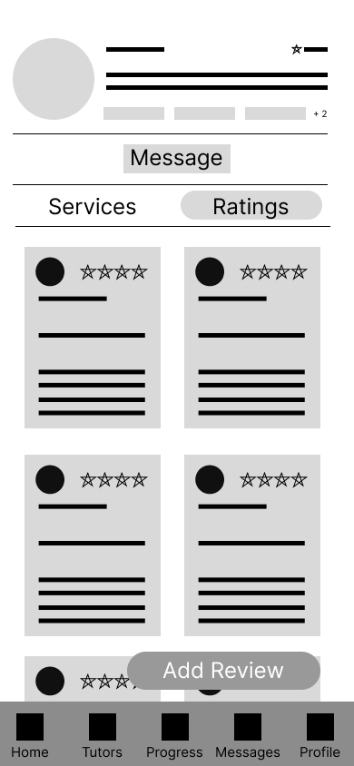
I decided to re-design the interface to have 2 sections which could be selected to show either the reviews or the services rather than trying to fit it all on in one screen. This makes the interface less text heavy and provides more intuitive buttons to ‘Book’ and adds the functionality to ‘Add Review’.
One key flow for tutors is adding their availability to the in-app calendar. Tutors can easily set the times and dates they’re available and specify which services can be booked during each session. This automatically syncs with the parent view, allowing parents to see real-time availability and book sessions instantly - removing the back and forth communication which was major a pain point in their current processes.
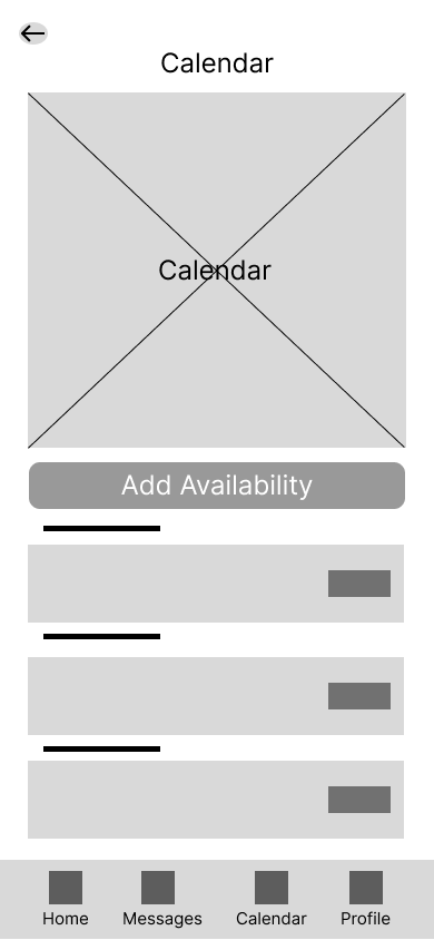
First screen in the ‘Add availability flow’ showing the calendar. User clicks add availability.

User adds the information for the available slot including what service can be booked during that time.
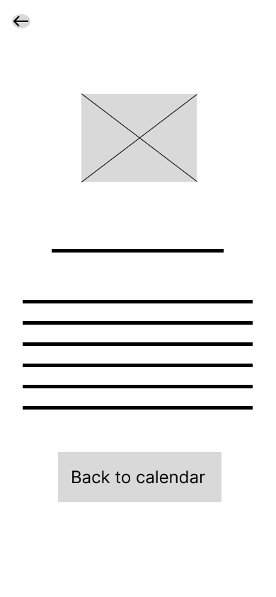
User gets a confirmation to say they have successfully added their availability.
Design System
To ensure consistency and efficiency across both the tutor and parent interfaces, I created a small design system.
This included typography, colour scheme and reusable components which streamlined the high-fidelity design process.
The colour scheme I chose focused on blues and purples.
This was based on competitor research which use similar colours.
Blue is also often associated with trust while purple can represent ambition.

The fonts used ensure they are easily readable and help create a hierarchy to help with navigation

To support a clear and consistent user experience, I developed a component library that defined core building blocks of the interface - including form inputs, buttons, navigation bars, cards and more.
Each component follows a shared colour scheme, typography and styling.
Building these early allowed me to rapidly create high-fidelity screens maintaining a unified, accessible design throughout the product.
These foundations guided the high-fidelity screens and ensured a cohesive experience across the tutor and parent journeys.
Hi-Fi Designs
Building on my wireframes and using my design system, I developed high-fidelity mock-ups to define the final visual style, hierarchy, and interaction patterns. These screens bring the tutoring experience to life with a clean, accessible interface designed for both parents and tutors.

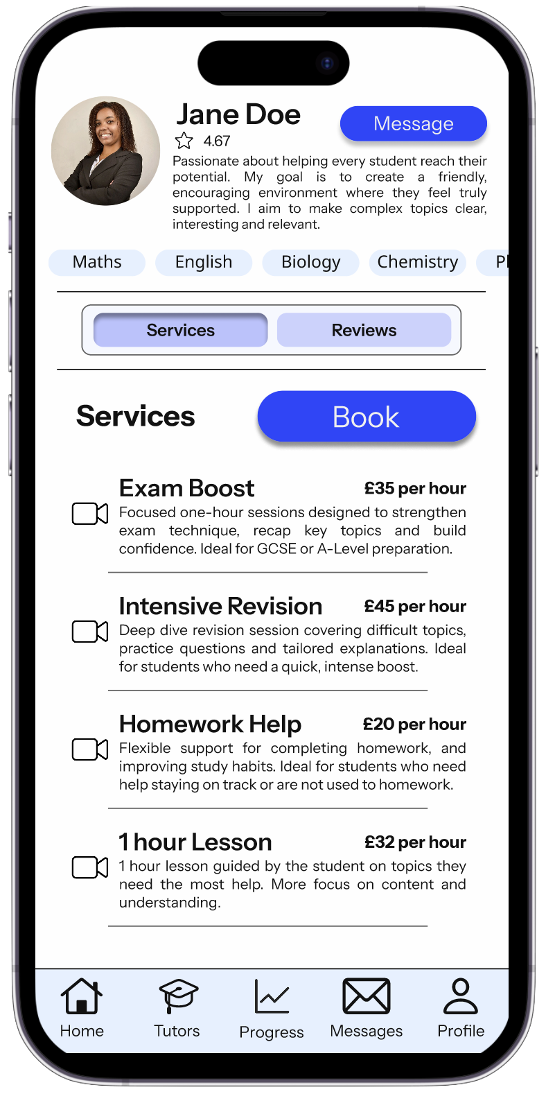
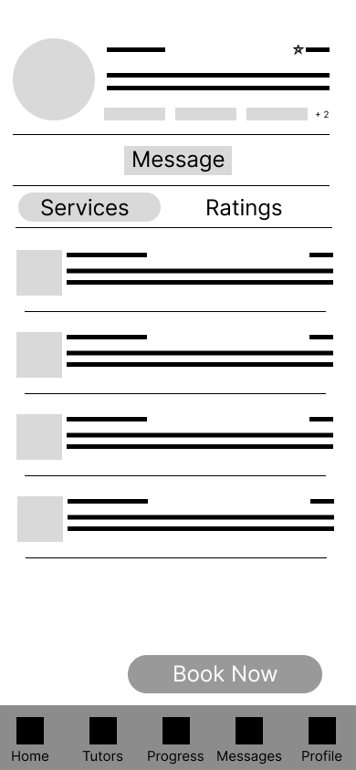
The tutor profile is a key area for decision making for parents, the focus for this design was clarity, transparency and trust.
It was important for parents to be able to build trust with their tutors. The top of the page highlights the profile with a concise bio and subjects available. The service and reviews toggle allows the parent to easily switch between real parent experiences and practical information all before making a booking.
These screens are designed to reduce the amount of uncertainty and support confident decision making.


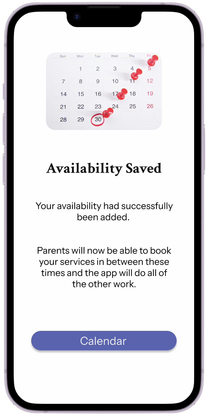
While converting the ‘add availability’ flow to a hi-fi design, I decided the flow could be simplified to reduce cognitive load for tutors.
Instead of selecting services for each availability slot, tutors now only choose the date, start and end times of their availability blocks, the system handles the rest. The app automatically checks availability, ensures there are no double bookings, bookings do not extend the end time and updates the tutors schedule in real time. This makes the scheduling process much faster, clearer and far less stressful.
Want to try the full prototype?
To try out the full Figma prototype, click here.
Overview
This project showcases my full UX design process - from research and insight synthesis to ideation, prototyping and iteration. It also demonstrates my skills in
User Research and Interviews
Empathy mapping and persona creation
Journey mapping and information architecture
Wireframing and interaction design (Figma)
Inclusive and accessible design thinking
The project reimagines how parents and tutors connect - transforming tutoring from a scattered processed into an organised, empowering experience. Through this project, I’ve built a foundation for a more connected tutoring experience - one that brings trust, clarity and communication to both parents and tutors.
Improvements are constantly being made to improve the design, if you have any feedback or would like to discuss the designs further please contact me.
Building trust through thoughtful design