
Designing for Inclusion
Women’s health apps are often designed for the average user making use of heavy interfaces with lots of text assuming they can process information, navigate interfaces and interpret icons in the same way. But for users with learning disabilities, this is often not the case - the tools designed to support wellbeing can become confusing or exclusionary.
Users with learning disabilities benefit from increased touch point sizes; easy read initiatives and interfaces which adhere to accessibility and contrast guidelines.
Challenge: Design an accessible women’s health application that allows for customisation of accessibility features while remaining engaging for all users.
Role: Lead UX Designer and Researcher
Empathise
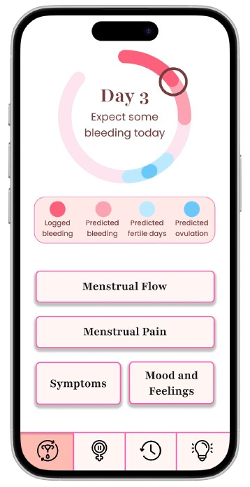
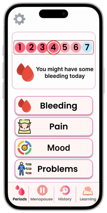
Design A = Exclusionary
To do this I created a more conventional interface based on research I did of existing applications.
More complex wording with very few icons
More muted colour scheme with less variety of colour throughout the app
Abstract representations of menstrual cycles and other women’s health concepts
More calendars
Mix of serif and sans-serif fonts
I designed two versions of a women’s health application to explore how non-disabled users perceived accessibility in design - and to understand their willingness to adopt accessible interfaces.
By stepping into the shoes of non-disabled users, I wanted to uncover how inclusive design choices are perceived.
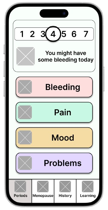
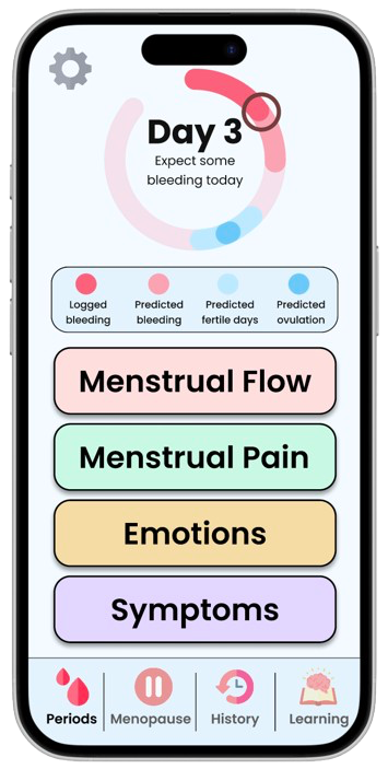
Design B = Accessible.
To do this I created a more followed WCAG guidelines and literature recommendations for users with learning disabilities. This can be seen in the image.
Easy read initiatives with icons and pictures
Bright colours with different sections in different colours
Less abstract representations of menstrual cycles and other women’s health concepts.
Fewer calendars
Sans-serif font as this is better for dyslexic users
Note: the designs shown are simplified recreations inspired by the original work. Due to ownership restrictions, the original images cannot be shown
I conducted a user study with participants without disabilities using the 2 designs to understand their preferences between the two designs and their willingness to adopt. Participants were not told which design was accessible and which was exclusionary to avoid bias.
👀 Participants View Designs → ✅ Choose Preferences → 💬 Discuss Insights → ✅ Willingness to Adopt
Participants preferred the accessible designs when asked about individual screens.
Participants preferred the accessible designs for 9 of the 10 individual pages. Preference for accessibility features such as wording and icons depending on the context.
Participants preferred the exclusionary design when asked about the design as a whole due to the colour scheme.
The participants preferred the colour scheme of the exclusionary design overall which led to them choosing to use that design if they were to use it as a daily app.
Participants wanted to be able to customise the design.
Participants liked the idea of being able to customise the design to make it perfect for them. This included things like choosing the colour scheme, wording, icons and representations.
When asked whether they would use an app designed for people with learning disabilities: 100% of participants said they would.
This research helped me understand how different users value control, clarity and personal preference in digital experiences.
Results echoed ideas from accessibility literature which highlighted the possibility of personalisation and customisation bridging the gap between accessible and mainstream digital experiences.
This stage helped me empathise with both user groups - understanding not only how accessibility benefits users with learning disabilities, but also how non-disabled users interpret these design differences.
Define
After gathering insights, I defined the problem defining key challenges and opportunities to take. I focused on balancing accessibility with the ability to customise the application to exactly suit the user’s needs.
Control and personalisation
Participants wanted the ability to customise the interface to suit their preferences. Literature also suggests personalisation benefits users with disabilities as everyone’s needs and requirements are unique.
Appreciation for accessibility features varied
Participants valued accessibility features differently depending on the context. For example, some preferred icons for bleeding but not for pain, and vice versa. This highlights the importance of allowing users to toggle accessibility features based on their individual preferences.
Simpler interfaces with multiple steps were preferred.
Participants found it easier to complete tasks when information was split across multiple, simpler screens, rather than combined into one complex interface. This supports the idea that progressive disclosure can enhance clarity and reduce cognitive load.
Participants valued colour scheme simplicity
Most participants preferred the simpler colour scheme. However, the bolder, brighter scheme was found to be more suitable for users with learning disabilities, as it improved visibility and distinction.
Participants had no strong preference for fonts.
While serif fonts were associated with a more professional look in the exclusionary designs, participants agreed that font choice did not significantly affect usability or preference.
The core problem my design aims to solve is:
How might we create a women’s health application that is accessible for users with learning disabilities while remaining customisable and engaging for all users?
I defined the main challenge as balancing accessibility with aesthetic and functional appeal for a diverse user base.
Design Goals
These goals became the foundation for my final prototype, which allows users to personalise their experience while maintaining an accessible baseline.
Accessibility by Default
Ensure the base app is accessible without the user needing any extra effort.
Customisable
Allow users to tailor visual features (icons, wording, colours)
Simplicity & Clarity
Keep content easy to navigate and understand.
User Empowerment
Give users choice over how their app feels and looks.
Due to time constraints while completing this project, I chose to use the 2 designs from the user study and additional setting pages to complete the design.
Prototype
Building on insights from the Define stage, I created a unified design that merged the best elements of both the accessible and exclusionary interfaces.
The goal was to design an experience that was inclusive by default, while allowing personalisation to meet individual user needs.
The final product is designed to have all accessibility features toggled on to begin with and offers the ability to remove certain accessibility features.
Each customisation included was a feature participants of the study could not agree on, or if they did agree it went against what users with learning disabilities needed.
These features included:
Icons on homepages
Icons on reporting pages
Colour scheme
Representations of concepts and calendars
Wording Complexity
Heading style
There are two methods of customising the application - app settings and individual page settings.
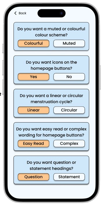
App settings include aspects of the design which affect the whole app or homepages. This includes things like colour scheme and heading style. This can be accessed from the menstruation or menopause home pages.

Page settings include aspects of the design which affect individual pages. This includes things like wording complexity and icons shown. These can be accessed from each of the reporting pages
The images below show how the homepage may look different depending which accessibility setting are toggled on and off.
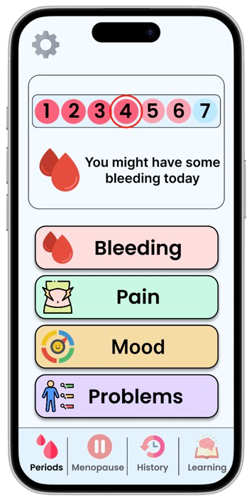
Original accessible design with bold colour scheme, linear menstruation cycle, icons and easy read text.
Some features toggled to show complex wording, circular representation and no icons.

Some features toggled to show easy read wording, circular representation and no icons with the muted colour scheme.
Features toggled to have a muted colour scheme, easy read wording and icons with the linear representation.
This demonstrated that accessibility and personalisation can coexist, allowing users to shape their own experience rather than fitting into one fixed design.
Reflection
This case study builds on the work I completed during my fourth-year dissertation. It began as a user study exploring participants’ willingness to adopt cognitively accessible interfaces and their design preferences. Two weeks before the submission deadline, after analysing the data, I decided to take the project a step further by designing a unified app that allowed users to personalise their experience.
The biggest challenge was deciding which features should be customisable and in what way. Initially, I wanted users to customise everything about the app - even inputting their own wording for buttons. However, on reflection, I realised this approach was technically infeasible and could easily become overwhelming for users. Instead, I used insights from the user study to determine which features could be toggled. This allowed me to create a defined list of options that still offered meaningful personalisation without adding unnecessary complexity.
Due to time constraints, I was unable to run a second usability study to evaluate the unified design. However, I believe that by allowing users to customise the experience, the app would improve usability and create a more positive, empowering experience - enabling each user to tailer the interface to their individual needs.